What Is Dynamic Branding?
Dynamic Branding is an identity that can be changed but has a basic element that always remains the same. Whether it is the word-mark, text/word itself, colours, or shape; the brand is still recognizable.
Dynamic Branding is a way of giving your identity a fresh look without completely changing the identity. You are able to connect to everything; you can change the logo in relation to the seasons, change it for a special occasion, etc. Dynamic Branding has proved to be successful a number of times, but it does not work well for every company.
Why Dynamic Branding And Why Not?
Dynamic Branding can mean that the company is in motion, evolving, developing, etc., or could also mean that the company is creative by expressing the creation of something new every now and then. On the other hand, an identity that is constantly changing can lose it’s credibility because people don’t know what to expect any more. It could evoke the feeling that the company is not considered trustworthy. Dynamic Branding also requires more resources, which means it’s more expensive than a static branding.
Examples of Dynamic Branding
Hadfield’s Paint
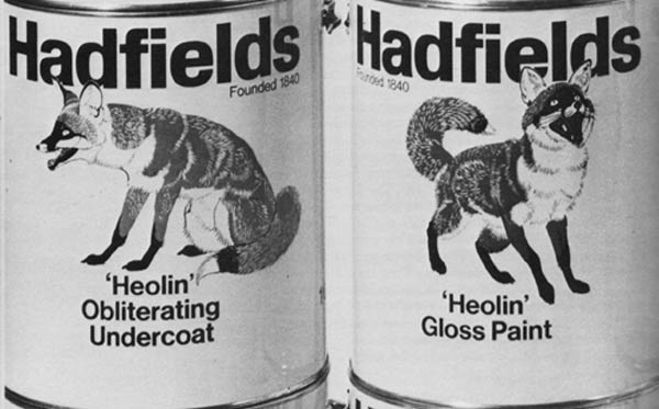
One of the earliest known uses of dynamic branding is on cans of paint by the company Hadfield’s Paint. They used a different image of a fox on the various cans of paint.
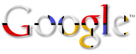
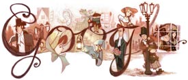
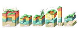
An example we all have encountered is Google. The most popular search engine started changing their logo in 1998. They’ve changed their logo over the years many times with their “Google Doodles” to remember an event in the past, celebrate a birthday, or another special day. They’ve got their own Google Doodles for every country! In the new digital age, those logo’s have become interactive as well. Like said earlier, something will always stay the same, in the case of Google this is either the word or the colours.
You can find all the Google Doodle’s here.
Aol
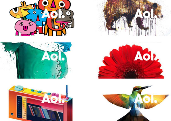
Another well-known company is AOL. Aol uses their wordmark as negative space in an image. This negative space is the thing that always stays the same, while the image changes.
If you want to see more examples of the AOL logo, just visit their website and refresh the page a couple of times.
Casa da Música
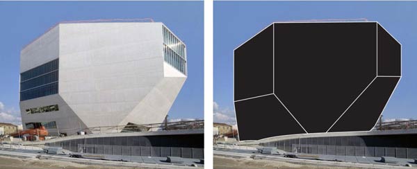
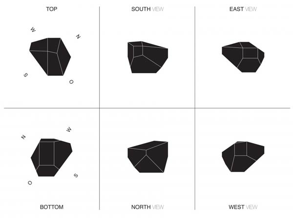
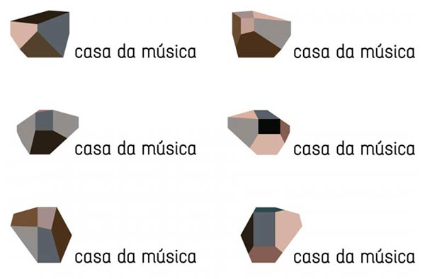
This identity was designed by Stefan Sagmeister. The logo of the identity was used to make the brand dynamic. For the logo, they used the silhouette of the building of the Casa da Música in Portugal, designed by Rem Koolhaas, from different viewpoints.
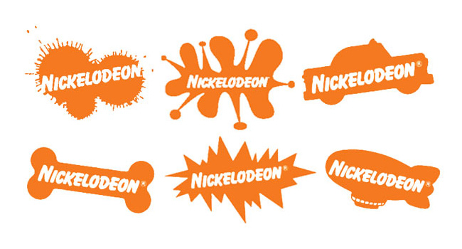
Nickelodeon
Designed by Tom Corey, Scott Nash and Alan Goodman. They used this branding between 1984 and 2009.
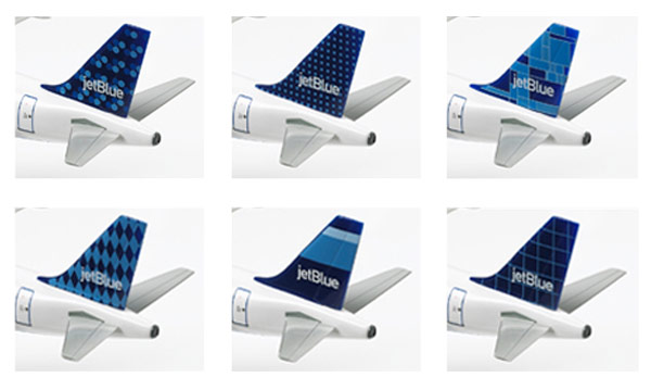
Jet Blue
In Conclusion
So this is Dynamic Branding, some say it kills the brand, while others say it sets the brand in motion. Whatever it is, there are different views on Dynamic Branding. Every project is different, so you’ve got to find out for yourself what the choice is going to be. Hopefully, this article can help you make the right decision.
